
Block Style Modifiers
Block Style Modifiers is a simple WordPress plugin that allows you to add multiple block styles to Gutenberg blocks.
Style Modifiers are additive CSS classes that:
- Can be applied in addition to a Block Style
- Can be selected multiple at the same time
- Support both checkbox (non-exclusive) and radio (exclusive) behavior per category
- Are predefined and documented by themes or plugins
- Preserve class order, allowing advanced CSS control
Category Behavior
Style modifiers are organized into categories with two behaviors:
- Non-exclusive categories (checkbox): Multiple modifiers can be selected simultaneously (default:
exclusive: false) - Exclusive categories (radio): Only one modifier from the category can be selected at a time (
exclusive: true)
Registering Categories
Categories are registered independently using block_style_modifiers_register_category() before any modifiers that belong to them. Modifiers then reference the category by its slug (string).
block_style_modifiers_register_category( $slug, $args )
$slug– Language-independent identifier for grouping (required, first argument)label– Translatable UI label (required)description– Optional category descriptionexclusive– Boolean flag for radio behavior (default: false)
Features
- Register multiple style modifiers for any block type
- Apply multiple style modifiers to a single block
- Global style modifiers that apply to all blocks
- Inline CSS support for easy styling of modifiers
- Structured category objects with exclusive/non-exclusive behavior
- Theme-independent default modifiers via Block Style Modifier Pack
Default Modifiers
Block Style Modifiers includes theme-independent default modifiers that work with any WordPress theme:
Philosophy:
* Enhance behavior, not visual design
* No borders, shadows, spacing, or color palettes
* Work with any theme without conflicts
* Atomic and performant
* Respect prefers-reduced-motion
Available Categories:
Animations (Exclusive) – Entrance animations for wrapper blocks
* Fade In – Smooth fade entrance
* Slide Up – Slide from bottom
* Slide Down – Slide from top
* Slide Left – Slide from right
* Slide Right – Slide from left
* Scale In – Scale up animation
* Rotate In – Rotate with fade
* Flip In X – 3D flip animation
Applied to: Group, Row, Stack, Grid, Column, Columns (wrapper blocks only)
Animation Delay (Exclusive) – Control animation timing
* Fast (0.2s)
* Normal (0.4s)
* Slow (0.8s)
Hover Effects (Exclusive) – Transform-based hover interactions
* Zoom In on Hover
* Subtle Rotate on Hover
* Bounce on Hover
* Shake on Hover
* Brighten on Hover
* Darken on Hover
* Grayscale to Color on Hover (Image/Cover only)
* Blur to Focus on Hover (Image/Cover only)
Applied to: Image, Cover, Media & Text (content blocks only)
Text Effects (Exclusive) – Micro-interactions for text
* Underline Reveal on Hover
* Soft Text Fade on Hover
Applied to: Paragraph, Heading (text blocks only)
All default modifiers respect accessibility preferences and are disabled when prefers-reduced-motion is set.
Architecture Note: Animations are only available for wrapper blocks (Group, Row, Stack, etc.) while Hover Effects are for content blocks (Image, Cover, Media & Text). This separation prevents CSS property conflicts and ensures all modifiers work seamlessly together.
You can easily extend or override these defaults by registering your own style modifiers in your theme or custom plugin.
Usage
- Define your style modifiers using the
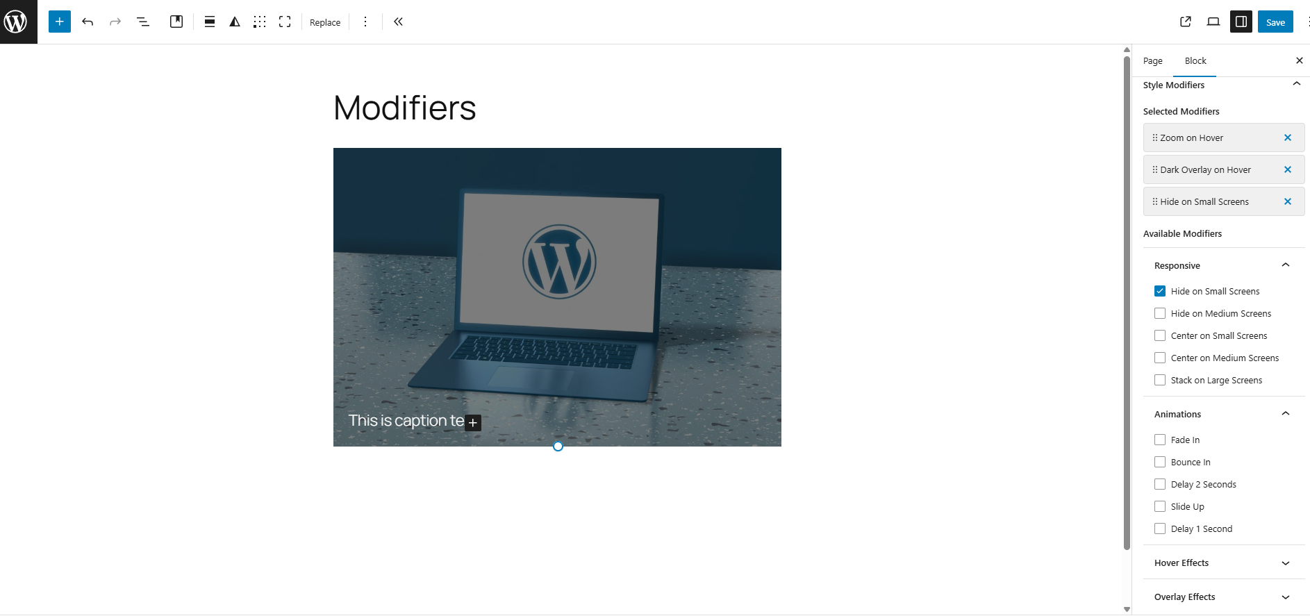
block_style_modifiers_register_stylefunction via your theme’sfunctions.phpfile or a custom plugin. - Select style modifiers in the block editor sidebar under “Block Style Modifiers”.
- Style modifiers will be applied as additional CSS classes to the block’s wrapper element.
- It is possible that reordering of classes may affect CSS specificity and styling.
Note: There is available an experimental plugin includes blocks style modifiers: Block Style Modifier Pack plugin to function.
Registering a Block Style Modifier
You can easily register your own style modifiers in your theme or custom plugin.
Here are some examples of how to register style modifiers with different category behaviors:
Step 1: Register Categories
block_style_modifiers_register_category( 'hover-effects', [
    'label'       => __( 'Hover Effects', 'my-theme' ),
    'description' => __( 'Transform-based hover interactions', 'my-theme' ),
    'exclusive'   => true,
] );

block_style_modifiers_register_category( 'responsive', [
    'label'       => __( 'Responsive', 'my-theme' ),
    'description' => __( 'Responsive visibility controls', 'my-theme' ),
    'exclusive'   => false,
] );
Step 2: Register Modifiers (Reference Category by Slug)
Exclusive Category (Radio Behavior)
block_style_modifiers_register_style( [ 'core/image', 'core/cover' ], [
    'name'        => 'zoom-on-hover',
    'label'       => __( 'Zoom on Hover', 'my-theme' ),
    'class'       => 'bsm-zoom-on-hover',
    'description' => __( 'Zoom into image on hover', 'my-theme' ),
    'category'    => 'hover-effects',
] );
Non-Exclusive Category (Checkbox Behavior)
block_style_modifiers_register_style( '*', [
    'name'     => 'hide-sm',
    'label'    => __( 'Hide on Small Screens', 'my-theme' ),
    'class'    => 'bsm-hide-sm',
    'category' => 'responsive',
] );
That’s it! You can now select multiple style modifiers for your blocks in the Block Editor.
Example Result in Markup
class="wp-block-cover has-custom-content-position is-position-bottom-left bsm-zoom-hover bsm-fade-in bsm-delay-normal"
It is important to note that the order of classes may affect CSS specificity and styling. You can easily reorder your modifiers with drag/drop functionality in the Block Editor.
Source Code
It is available on GitHub:
* GitHub: https://github.com/Arkenon/block-style-modifiers