
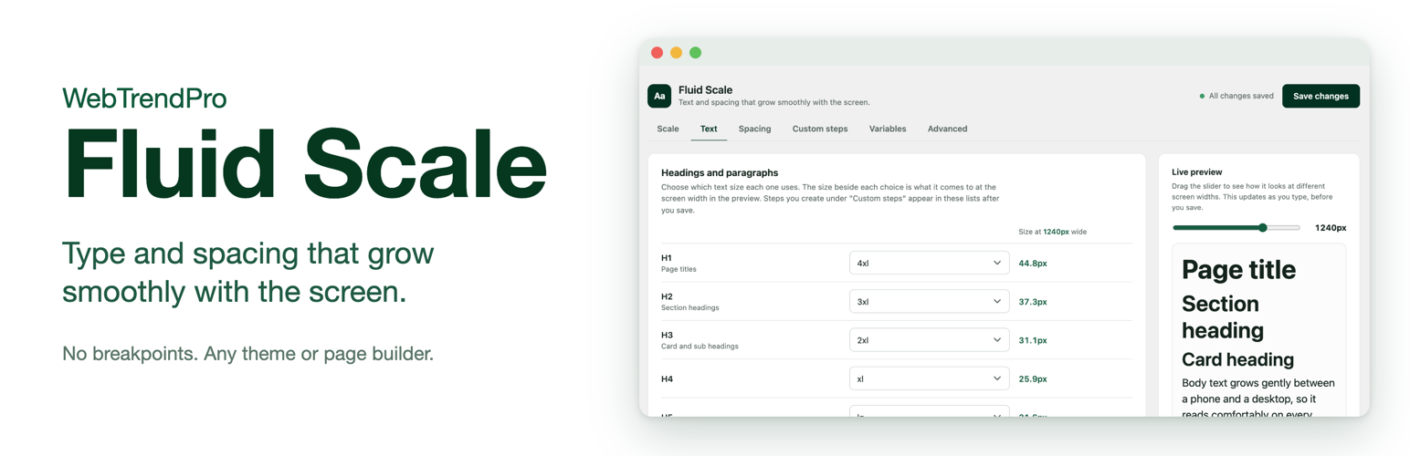

WebTrendPro Fluid Scale
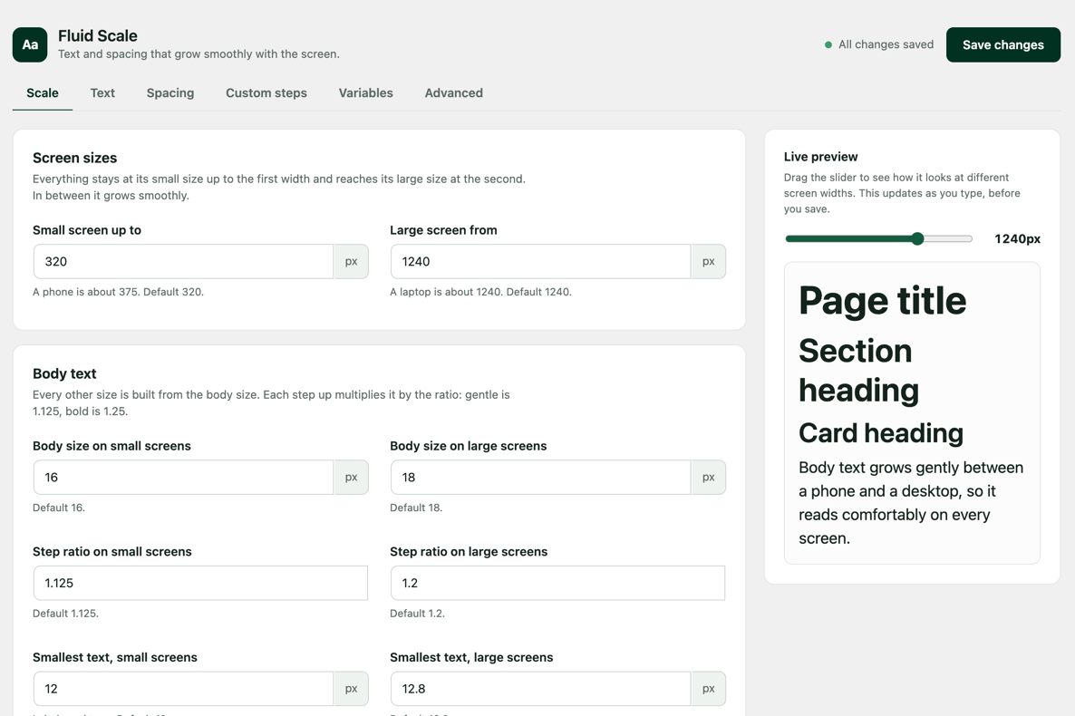
The Scale tab: screen sizes, body text and a live preview with a screen-width slider.
WebTrendPro Fluid Scale publishes a set of CSS custom properties for text sizes and spacing. Each one grows smoothly between a small-screen size and a large-screen size, so you do not need breakpoints or media queries to make a layout fluid.
It is based on the Utopia fluid design method by James Gilyead and Trys Mudford. WebTrendPro Fluid Scale is not affiliated with or endorsed by Utopia. Oxygen and Breakdance are trademarks of their respective owners, and this plugin is not affiliated with or endorsed by them.
What you get
- Text sizes:
--text-xs,--text-sm,--text-base,--text-lgup to--text-4xl - Space sizes:
--space-3xsup to--space-3xl, plus pairs such as--space-s-mthat grow faster than a single size - Your own extra text sizes, space sizes and pairs, as many as you need
- Roles that pick which size headings, paragraphs, sections, cards and buttons use, so one change updates the whole site
- A settings page with a live preview and a screen-width slider
- Plain CSS you can copy for sites where you cannot install plugins
- Export and import of settings between sites
Good to know
The variables use common names (--text-* and --space-*) and are published so that they win over a theme’s variables with the same name. If your theme already uses those names, change the prefixes under Advanced.
How to use it
The plugin only defines variables. Point your CSS at them, for example:
font-size: var(--text-base); padding: var(--space-m);
Page builder option
If the site uses Oxygen or Breakdance, two optional boxes under Settings > Fluid Scale > Advanced connect the plugin to the builder. Both are off by default.
- Show these values in the builder’s variable list: updates the value of any builder variable that has the same name as a Fluid Scale variable, such as
--text-lg, so the numbers in the builder match. - Use this scale for the builder’s own default sizes: makes the builder’s default text and spacing follow the scale, overriding the same settings in the builder’s global settings. It also updates the matching entries in the builder’s variable list.
The plugin only changes the value of entries that already exist in the builder’s variable list. It never adds, removes or renames entries and never touches fonts. It remembers each original value and puts it back when you untick the box or delete the plugin.