

Touch Slider for Elementor
5/5 (1 ratings) 100 active installs Updated Aug 14, 2026

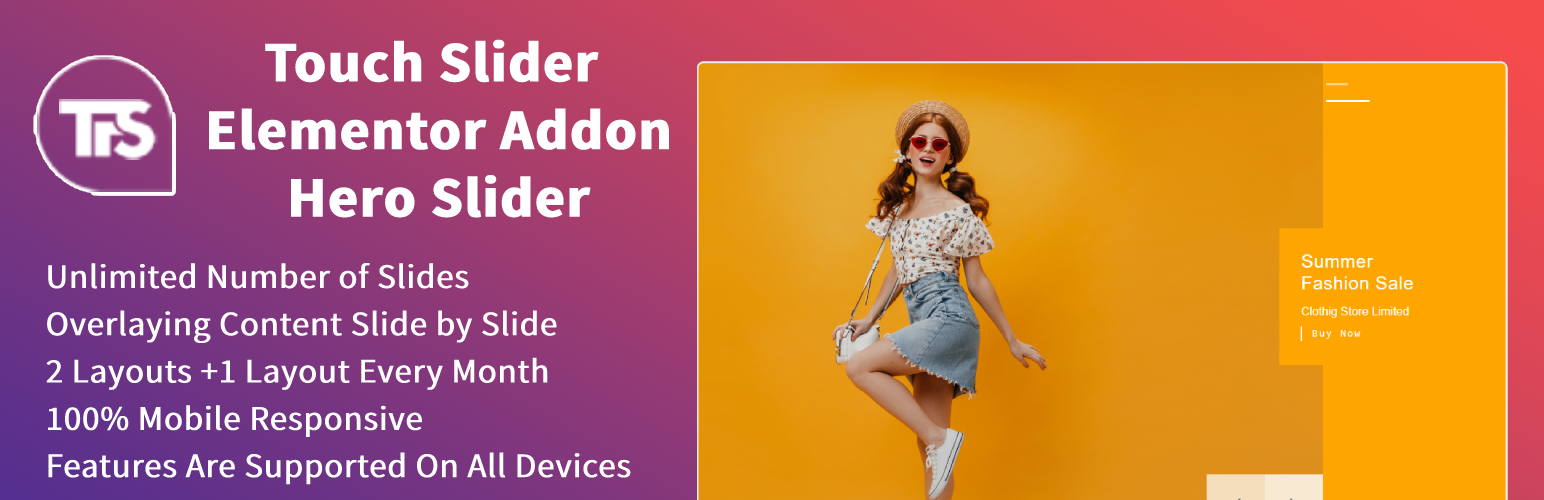
Touch Slider for Elementor adds one advanced slider widget to Elementor.
Version 2.0 consolidates the older separate hero slider widgets into a single widget with a template selector. Existing Hero Slider 1 and Hero Slider 2 designs are preserved as Classic Split and Cinematic Cover, while additional layouts expand the design system without cluttering the Elementor panel.
Features include:
- One Elementor widget with multiple templates.
- Original Classic Split and Cinematic Cover templates retained.
- New Editorial Split, Product Showcase, Glass Card, and Spotlight Frame templates.
- Responsive desktop and mobile images per slide.
- Primary and secondary call-to-action buttons.
- Per-slide accent, background, text, and overlay colors.
- Responsive height, content width, padding, alignment, and image positioning.
- Typography controls for labels, titles, descriptions, and buttons.
- Arrow and pagination styling.
- Slide, fade, cube, and coverflow transitions.
- Optional autoplay, loop, keyboard, mousewheel, touch drag, and grab cursor.
- Accessible labels and reduced-motion support.
- Conditional frontend asset loading through Elementor widget dependencies.
- Uses Elementor’s conditional Swiper runtime instead of bundling a duplicate global slider library.
- One-time migration of legacy Elementor Hero Slider 1/2 widget data to the unified widget.