
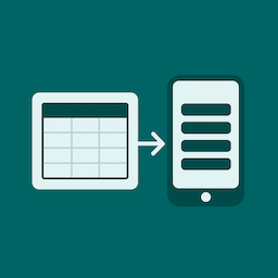
Responsive Table for Elementor

Desktop table view
Responsive Table for Elementor is a lightweight, easy-to-use widget designed to make small tables look beautiful on any device. Unlike bulky table plugins, this widget focuses on simplicity and readability — perfect for tables with up to 5 columns that automatically transform into a clean card-style layout on mobile.
If you don’t need huge spreadsheets or endless columns, and just want a sleek, responsive table that works out of the box, this widget is for you.
Perfect for:
– Pricing tables
– Schedules and timetables
– Feature comparisons
– Any compact dataset that must look great on mobile
Features (Free Version):
* Fully responsive tables that stack into cards on mobile
* Customizable table header and body styles
* Toggle borders on/off
* Unlimited rows (up to 5 columns)
* Simple Elementor widget interface — no shortcodes needed
* Input HTML into cells
* Easily adjust row background colours for better readability
Pro version (coming soon!)
– Icons inside cells
– Add buttons to cells
– More than 5 columns
– Border styling
– Horizontal Scrolling for larger tables
– Priority support
If you want to be notified when the Pro version launches, click here.
Arbitrary section
If you have questions or feature requests, feel free to contact me at [email protected].