


GfDesigns
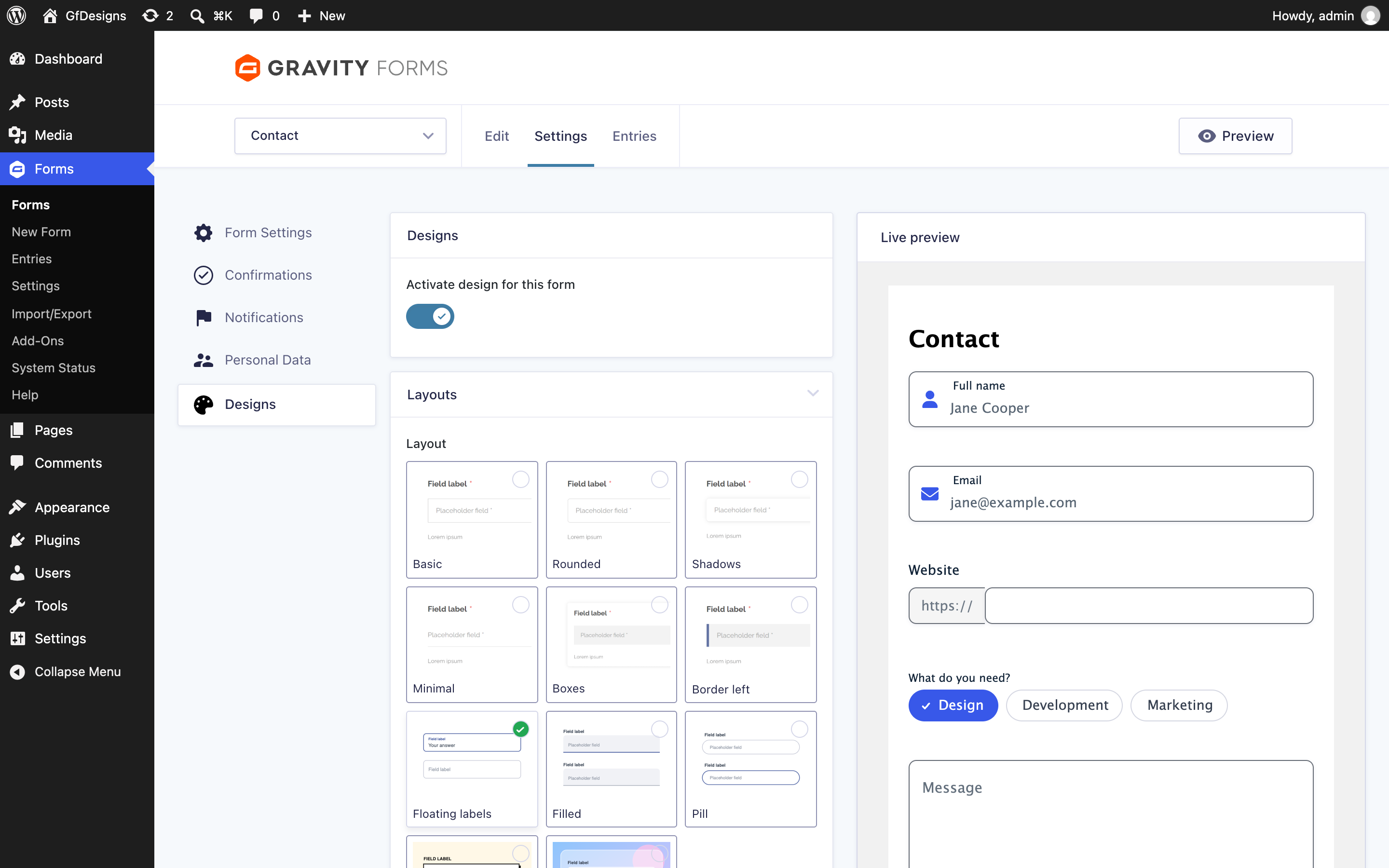
The Designs tab: every option with a live preview of your form.
GfDesigns styles your Gravity Forms in a few clicks. Pick a layout, a style for checkboxes and radio buttons, for file uploads and for buttons, choose your color, and see the result in a live preview while you change the settings.
Every design is free. GfDesigns PRO no longer exists: all of its styles are now part of GfDesigns.
GfDesigns is built the Gravity Forms way, on the official Add-On Framework and Theme Layers. Designs are applied on top of the Orbital theme through its CSS API, so the Gravity Forms block style settings keep working. Forms that use the “Gravity Forms 2.5” theme keep working in compatibility mode.
Layouts
11 layouts: Basic, Rounded, Shadows, Minimal, Boxes, Border left, Floating labels, Filled, Pill, Neo-brutalism and Glass (a translucent card for forms placed over an image or a gradient).
Checkboxes & radio buttons
18 styles: Default, Basic, Rounded, Cards, Segmented control, Chips and 12 switches (square, rounded and skew, with on/off text, icons or bullets). Checkboxes and radio buttons can also be shown inline.
File uploads
6 styles: Default, Basic, Button, Box, Drop zone (with a preview of the selected image) and Avatar (a circular picker for profile pictures).
Buttons
8 shapes and 17 styles: shadow, background slide, relief, close, circle, offset, shine, pulse, minimal, minimal line, solid shadow, blob, arrow, gradient, glow and shimmer (animated while the form is being sent).
More options
- Main color: buttons and checked elements use it, and their text color is chosen automatically so it is always readable.
- Dark mode: off, on or automatic (follows the visitor’s device).
- Density: compact, regular or comfortable.
- Segmented steps and progress bar for multi-page forms.
- Animated feedback: validation errors shake and show an icon, and the confirmation appears with an animated check. Animations are disabled for visitors who prefer reduced motion.
- Fixed pretext at the beginning of text inputs (for example “https://”), saved with the entry.
- Font Awesome icons in text inputs, with a searchable picker in the form editor. The icons are bundled with the plugin: no external requests.
Requirements
Gravity Forms 2.8 or newer.
Credits
Icons: Font Awesome Free by Fonticons, Inc., licensed under CC BY 4.0.