

ShapedGallery – Photo Gallery, Image Gallery, Video Gallery & Lightbox
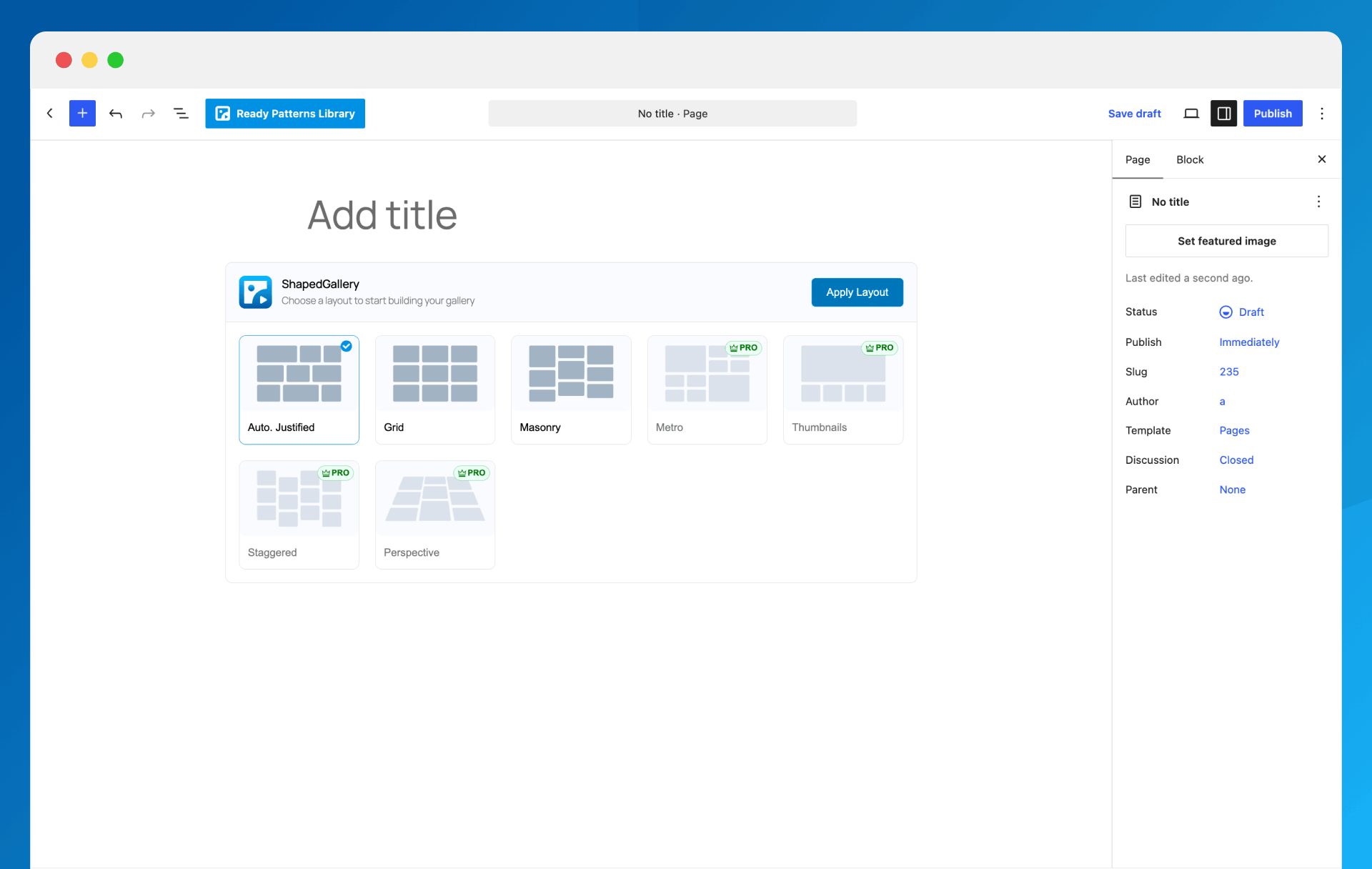
Choose from multiple gallery layouts: grid, masonry, justified, and more
Create beautiful image galleries with ShapedGallery’s visual layout picker. Build justified, grid, masonry and video galleries without writing a line of code. It’s made for photographers, designers, bloggers, agencies and anyone who wants a fast, responsive gallery on their WordPress website.
ShapedGallery makes building a photo gallery simple. Pick a layout, add images from your Media Library, style it in the live preview, and publish. What you see in the editor is what your visitors get, on desktop, tablet and mobile.
Live Demo | Documentation | Support | Upgrade to Pro!
The Fast, Block-First WordPress Gallery Plugin
Most gallery plugins make you work in a separate settings screen and guess how the result will look. ShapedGallery works inside the WordPress block editor you already use. Add the ShapedGallery block, choose a layout, and you’re looking at your finished gallery right away.
Every gallery is rendered on the server as clean HTML. Your images load with the rest of the page instead of jumping into place a moment later, and search engines can read your images, titles and captions like any other content. Pages without a gallery load none of the plugin’s files at all, so your site stays fast.
Why Choose ShapedGallery?
✅ Visual layout picker – See every gallery layout before you choose it, then switch layouts any time without re-adding images.
✅ Media Library first – Build galleries from the photos and videos you’ve already uploaded.
✅ Ready Patterns – Start from a professionally designed gallery with one click.
✅ Built-in lightbox and video player – A modern, mobile-friendly lightbox for your images, and videos that play right in the gallery or in their own popup.
✅ Build once, use anywhere – Every gallery gets a shortcode. Edit it once and it updates on every page.
✅ Lightweight and fast – Scripts load only where a gallery appears.
✅ Works with your page builder – Elementor, Divi, Bricks, Oxygen, Beaver Builder and WPBakery.
Responsive Gallery Layouts
Justified Gallery
Rows of equal height with image widths balanced so every row fills the space edge to edge. The best choice for photographs of mixed sizes and orientations, and nothing gets cropped.
Grid Gallery
Equal tiles in a set number of columns. A clean, tidy look for portfolios, products, team photos and logos.
Masonry Gallery
Pinterest-style columns of different heights with the gaps closed, so tall and wide images sit together naturally.
Every layout is fully responsive. Set columns and spacing separately for desktop, tablet and mobile so your gallery looks right on every screen.
Ready Patterns: Start With a Designed Gallery
Not sure where to begin? Open the Ready Patterns library, preview a design, and insert it with one click. Patterns are grouped by layout, and each one stays fully editable, so you just swap in your own photos. You can open the library from the block toolbar, the editor header or the dashboard.
Video Gallery Support
Mix photos and videos in the same gallery, or build a video gallery on its own. Add:
- Videos from your Media Library
- External videos by URL
- YouTube videos
Choose how videos play with Video Play Mode: right inside the gallery tile, or in a dedicated video popup with its own player. Either way, videos keep out of the image lightbox, so a slideshow of your photos is never interrupted by a clip.
Built-in Lightbox Gallery
Let visitors view your photos full size without leaving the page. The lightbox is built on the browser’s own <dialog> element, so it’s fast and accessible:
- Zoom and pan on desktop, pinch and swipe on phones and tablets
- Image counter
- Keyboard navigation with arrow keys, and Escape to close
- Loads only on pages where a gallery opens it
Customize Your Gallery Design
- Titles and descriptions pulled from each image’s title, caption or description
- Classic or overlay caption styles with full typography control
- Border, rounded corners and box shadow for each image, in Normal and Hover states
- Choose the image size: thumbnail, medium, large or full
- Default or random image order
- Click action per gallery: open the lightbox, follow a link, or do nothing
Built for Speed and SEO
- Server-rendered, search-engine-friendly gallery markup
- Lazy loading for images
- Gallery output caching with an adjustable timeout and one-click cache clearing
- Scripts and styles load only on pages that need them
- Ajax Load More button to split big galleries into smaller chunks
Private and Password-Protected Galleries
Share photos with only the right people. Each gallery can be public, private or password-protected, which is handy for client galleries, event photos and member-only content.
Works With Gutenberg and Popular Page Builders
ShapedGallery is a native Gutenberg block. Every saved gallery also has a shortcode you can use in the Classic Editor, widgets and theme templates. Dedicated elements are included for:
- Elementor
- Divi
- Bricks
- Oxygen
- Beaver Builder
- WPBakery
Elementor is on by default. Turn on the others in ShapedGallery Settings Integrations.
Full Feature List (Free)
- Visual gallery layout picker with live preview
- Justified, grid and masonry gallery layouts
- Responsive columns and spacing for desktop, tablet and mobile
- Ready Patterns library with one-click insert
- Image and video galleries from the Media Library
- External images and videos by URL, plus YouTube videos
- Built-in lightbox with zoom, pinch, swipe and keyboard support
- Video Play Mode: play videos inline in the tile or in a popup player
- Image Custom URL – link any image to a page, product or external website
- Ajax pagination with a customizable Load More button
- Image titles and descriptions with typography controls
- Per-image border, radius and shadow for Normal and Hover states
- Hide a gallery on desktop, tablet or mobile
- Public, private and password-protected galleries
- Lazy-loaded images and gallery caching
- Saved Galleries dashboard with search, copy shortcode, duplicate and bulk actions
- Turn modules (Lightbox, Image Custom URL, Ready Patterns) on or off site-wide
- Multisite support
- Translation-ready and accessible, with full keyboard support