
Carousel Slider Block for Gutenberg
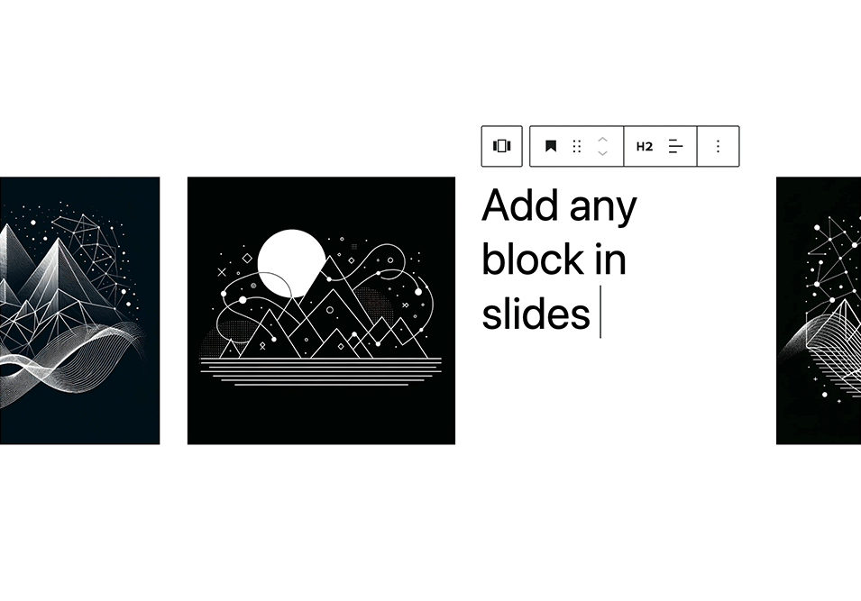
Add any blocks to the carousel slides
A responsive modern carousel slider for the Gutenberg block editor that lets you add any blocks to your slides. Easily create sliders for hero sections, testimonials, products, and anything else using Gutenberg blocks.
🚀 Carousel Slider Version 2 is built on the modern Swiper.js library for improved performance and better mobile compatibility.
Plugin site: carouselblock.com
Features
- Add unlimited slides
- Add any blocks to the slides
- Preview the carousel in the editor
- Responsive and touch enabled
- Developer friendly: supports CSS variables & theme.json
- Accessibility-ready with keyboard navigation and ARIA labels
Settings
- Slides per view
- Slides to scroll at a time
- Slide speed
- Slide padding
- Prev/next arrows
- Dots navigation
- Infinite loop sliding
- Autoplay
- Pause on hover
- Disable on interaction
- Responsive settings: slides to show and scroll at given screen size
- RTL
Advanced Settings
For dynamic layouts where the slider or its surrounding layout changes after load, such as tabs, accordions, or lazy-loaded content.
- ResizeObserver
- Observer
- Observe parent elements
- Observe slide children
Plugin Settings
Plugin settings are available from Settings > Carousel Slider in the WordPress admin.
Available options include showing legacy carousel blocks, hiding the legacy warning notice, and loading the full Swiper bundle instead of the default custom Swiper build.
Included Patterns
- Full Width Hero Slider
- Testimonials Slider
- Logos Carousel
The final look of these sliders depends on your theme styles. You can also fine-tune the design using custom CSS variables (see below).
Requirements
PHP 5.6+ is recommended, WordPress 5.8+, with Gutenberg active.
Documentation
Full documentation: carouselblock.com/docs
Select the Carousel Slider block from the Design category. Click the + button located at the end of the carousel to add slides. Add any block within the slides. Use the horizontal scrollbar to preview the slides in the editor.
You can reorder the slides by using the left and right arrow buttons in the toolbar.
To remove a slide, select the slide and click the three dots right above it. Click the option to remove that slide.
Click the Carousel Block (the block nesting all the slides) to show the carousel settings.
Upgrading from Legacy Carousel
See the support topic for upgrading legacy blocks to Carousel Slider Version 2.
Carousel Slider settings are available from Settings > Carousel Slider in the WordPress admin.
Customizing Styles
Carousel Slider v2 supports custom styling via CSS variables:
Styling documentation: carouselblock.com/docs?doc=styling
Navigation
--wp--custom--carousel-block--navigation-size: Arrow icon size--wp--custom--carousel-block--navigation-sides-offset: Distance from edge--wp--custom--carousel-block--navigation-color: Arrow color--wp--custom--carousel-block--navigation-hover-color: Arrow hover color (falls back tonavigation-color)--wp--custom--carousel-block--navigation-alignfull-color: Arrow color when carousel is full width
Pagination (dots)
--wp--custom--carousel-block--pagination-top: Top offset--wp--custom--carousel-block--pagination-bottom: Bottom offset--wp--custom--carousel-block--pagination-bullet-size: Bullet size--wp--custom--carousel-block--pagination-bullet-active-color: Active bullet color--wp--custom--carousel-block--pagination-bullet-inactive-color: Inactive bullet color--wp--custom--carousel-block--pagination-bullet-inactive-hover-color: Inactive bullet hover color (falls back toactive-colorif set)--wp--custom--carousel-block--pagination-bullet-active-opacity: Active bullet opacity--wp--custom--carousel-block--pagination-bullet-inactive-opacity: Inactive bullet opacity--wp--custom--carousel-block--pagination-bullet-inactive-hover-opacity: Inactive bullet opacity on hover (falls back toinactive-opacityif not set)--wp--custom--carousel-block--pagination-bullet-horizontal-gap: Space between bullets (horizontal)--wp--custom--carousel-block--pagination-bullet-vertical-gap: Space between bullets (vertical)
Block Spacing
--wp--custom--carousel-block--image-margin-top: Top margin for image blocks--wp--custom--carousel-block--image-margin-bottom: Bottom margin for image blocks--wp--custom--carousel-block--cover-margin-top: Top margin for cover blocks--wp--custom--carousel-block--cover-margin-bottom: Bottom margin for cover blocks
Theme JSON Support
All the CSS variables can also be defined directly inside your theme’s theme.json under the settings.custom key.
For example:
{
  "settings": {
    "custom": {
      "carousel-block": {
        "navigation-size": "22px",
        "navigation-color": "#000",
        "pagination-bullet-active-color": "#000"
      }
    }
  }
}
Frontend API
Carousel Slider exposes a small frontend API for integrations with tabs, accordions, modals, or other hidden UI.
For some of these dynamic layout cases, the Advanced Settings observer options can also handle updates automatically.
window.CarouselSliderBlock.init( container ): Initializes carousel instances inside the given container.window.CarouselSliderBlock.update( container ): Updates existing carousel instances inside the given container and initializes any that are not yet initialized.