

Blockshifter
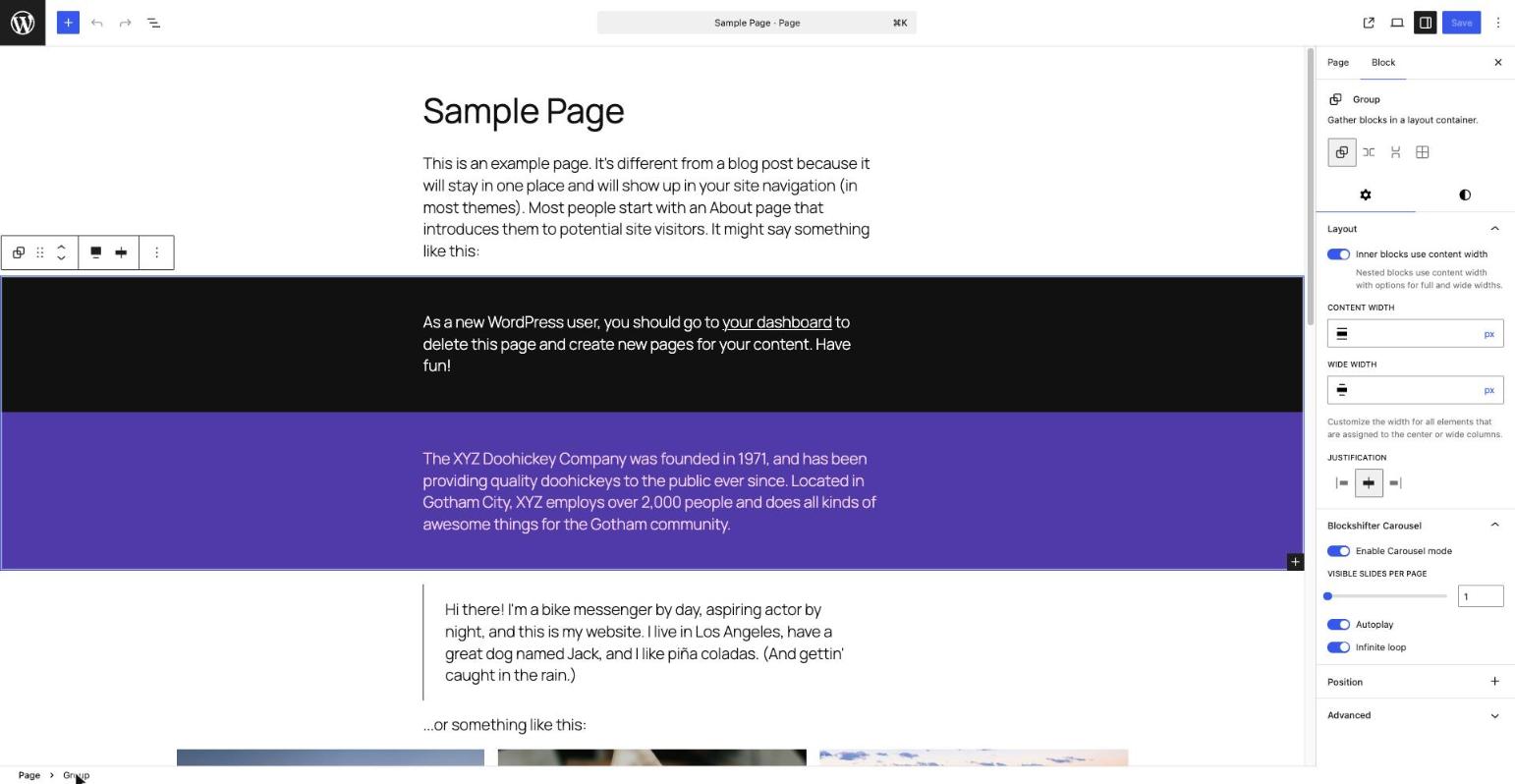
The Blockshifter Carousel panel in the Inspector of a Group block, with the Carousel mode enabled and its settings (slides per page, autoplay, infinite loop) visible.
Blockshifter is a growing toolbox of display modes for native Gutenberg blocks — no new block types, no leaving the block editor, no learning curve.
Pick a block you already use — Gallery, Group — flip a toggle in its Inspector, and its front-end output transforms. The block itself stays 100% native and editable; nothing about how you write content changes.
Think of Blockshifter as a shape-shifter for your blocks: same content underneath, a different shape on the front end. Today it shifts into a Carousel; tomorrow more shapes join the same toolbox, each just as simple to switch on.
Carousel, live today
A clean, minimalist carousel for Gallery and Group blocks, powered by Splide.js — lightweight, accessible, dependency-free. Arrows and pagination are styled to sit quietly on top of your content, in any color, on any background.
- One toggle to turn a block into a carousel
- Slides per page
- Autoplay
- Infinite loop
- Fully responsive, keyboard and screen-reader friendly out of the box
More shapes are coming
Accordion, Masonry, and other display modes are on the roadmap. Every future module follows the exact same pattern you already know: pick a block, flip a toggle, done.
For developers
The list of blocks a module targets is filterable, so you can extend the Carousel module to other core blocks without forking the plugin:
add_filter( 'blockshifter/carousel/allowed_blocks', function( $blocks ) {
    $blocks[] = 'core/columns';
    return $blocks;
} );
Development
Source code, build tools and issue tracker: https://github.com/nighcrawl/Blockshifter
The src/ directory contains the human-readable, unminified source for everything shipped in build/. See the repository’s README for the build steps (composer install && npm install && npm run build).