
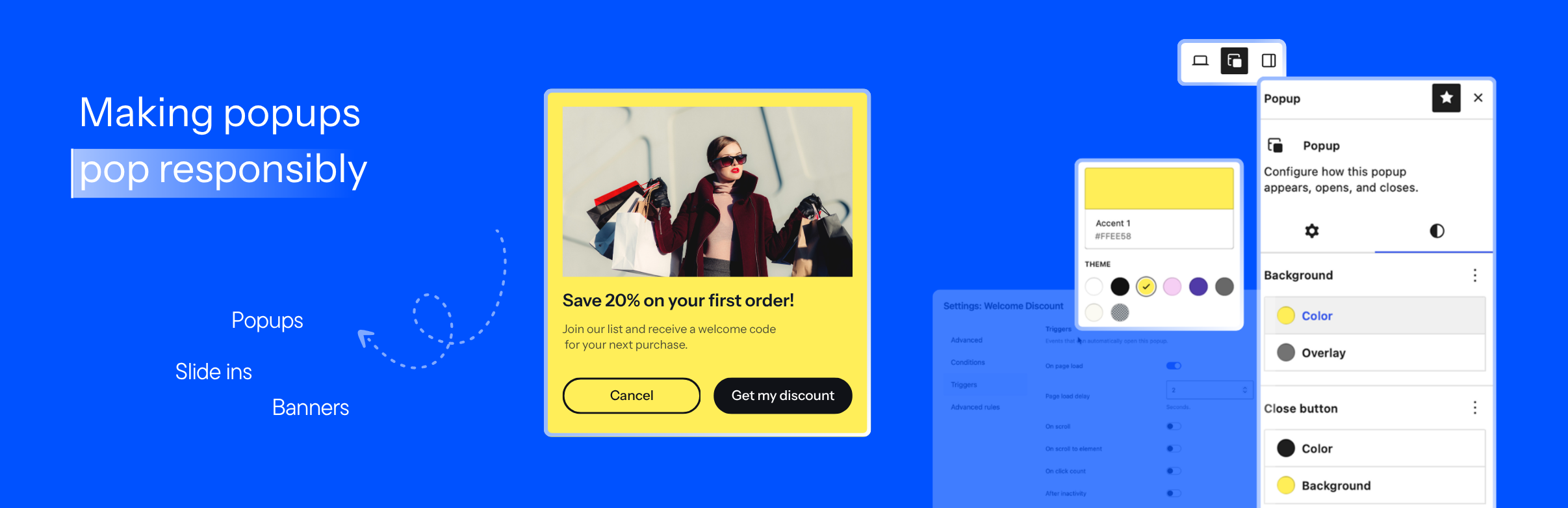

BlaBlaBlocks Popup
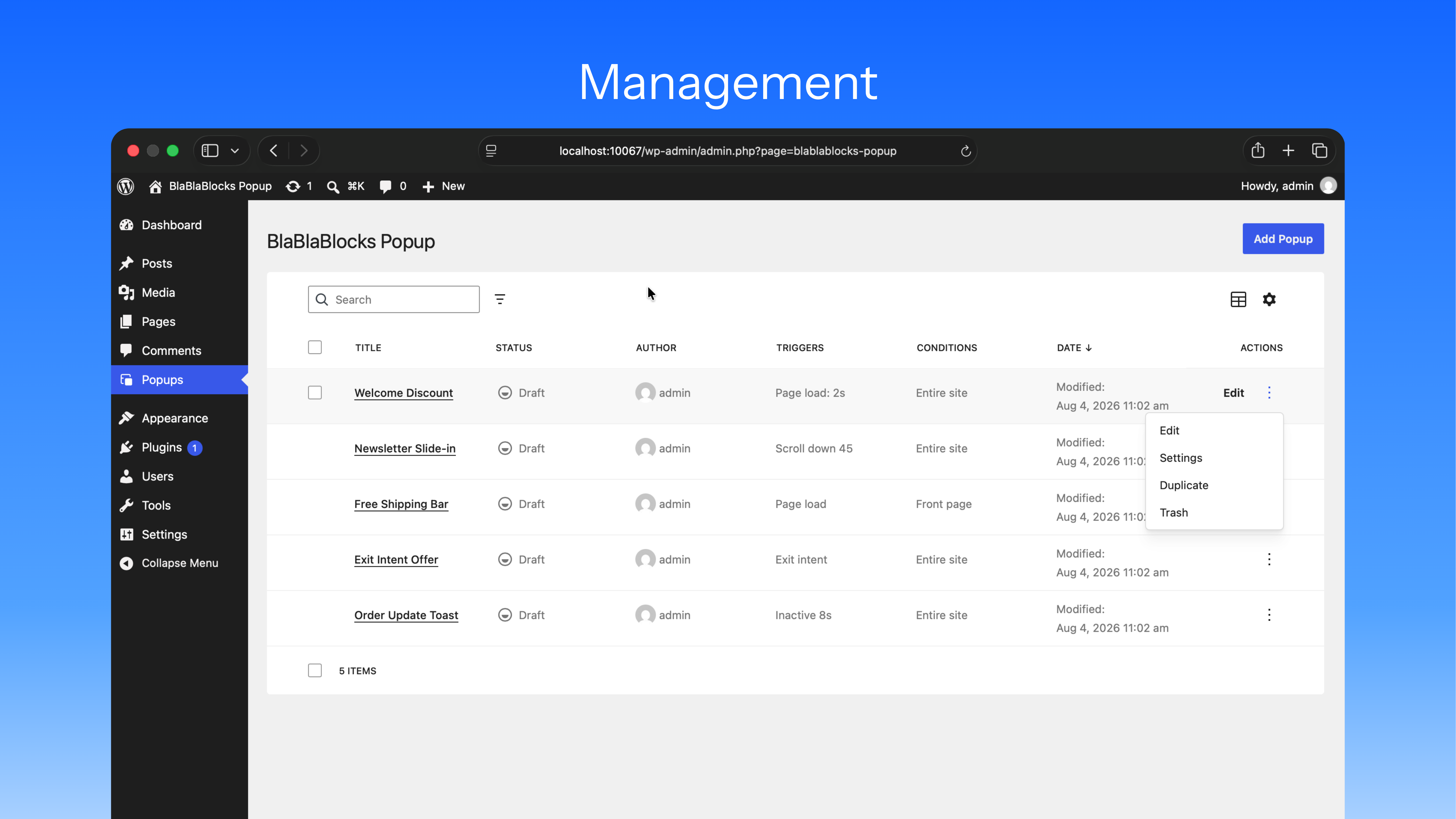
<strong>Management</strong> – Manage popups from the DataViews screen.
Build Popups in the WordPress Block Editor
BlaBlaBlocks Popup is a powerful yet lightweight WordPress plugin that empowers you to create and manage dynamic popups seamlessly using the native Block Editor (Gutenberg).
Choose a starter layout, edit its content in the native Block Editor, and control where, when, and how the popup appears from dedicated settings.
Why Choose BlaBlaBlocks Popup?
BlaBlaBlocks Popup combines a familiar editing experience with modern WordPress APIs. Popup content uses the Block Editor, management uses DataViews and DataForm, and frontend interactions run through the WordPress Interactivity API.
Key Highlights
- Native Block Editing: Build popup content with core and third-party blocks.
- Starter Layouts: Start with a modal, slide-in, floating bar, fullscreen popup, or toast notification.
- Flexible Display Conditions: Target the entire site, front page, selected posts or pages, and archives.
- Multiple Triggers: Open popups on page load, scroll, click count, inactivity, exit intent, or a manual selector.
- Advanced Display Rules: Limit popups by page views, sessions, display count, referrer, login state, user role, and device.
- Modern Popup Management: Search, filter, sort, duplicate, trash, restore, and permanently delete popups from a DataViews screen.
Key Features
1. Native Popup Content Editing
Each popup is created as dedicated WordPress content with revision support. Use headings, paragraphs, images, buttons, forms, columns, groups, and other blocks directly in the editor.
2. Ready-to-Use Popup Types
Choose a starting layout when creating a popup:
- Modal Popup
- Slide-in Popup
- Floating Bar
- Fullscreen Popup
- Toast / Small Notification
The selected layout provides a useful starting point while remaining fully customizable.
3. Layout and Style Controls
Configure the popup from its editor sidebar:
- Width, height, and screen position
- Overlay and close button visibility
- Background and overlay colors
- Padding and margin
- Borders and border radius
- Entrance and exit animations
4. Triggers and Manual Opening
Automatically open a popup using page load delay, scroll amount, scroll direction, scroll-to-element, click count, inactivity, or exit intent.
For direct control, add CSS selectors that open the popup from a link, button, navigation item, or other page element.
5. Conditions and Audience Rules
Choose where a popup can appear and who can see it. Conditions support site-wide, front page, singular content, and archive targeting. Advanced rules can limit displays by browser state, referrer, logged-in status, roles, and device type.
6. WordPress Interactivity API
Frontend opening, closing, trigger evaluation, and popup state use the WordPress Interactivity API. Assets are loaded only when the current request has an eligible published popup.
How to Create a Popup
Step 1: Add a Popup
Open Popups in the WordPress admin menu and click Add Popup. Enter a title to create a draft.
Step 2: Choose a Popup Type
Select a modal, slide-in, floating bar, fullscreen, or toast layout as your starting point.
Step 3: Design the Content
Add and arrange blocks in the editor. Use the popup sidebar to adjust layout, colors, spacing, borders, and animations.
Step 4: Configure Display Settings
Set the popup’s conditions, triggers, and advanced rules from the popup management screen.
Step 5: Publish and Test
Publish the popup and test its triggers, close behavior, responsive layout, and targeting on the frontend.
Common Use Cases
- Email Signup Forms: Present a focused subscription form after a delay or scroll threshold.
- Announcements: Display product launches, service updates, or important notices.
- Promotions: Show time-sensitive offers and calls to action.
- Floating Notices: Keep a compact message visible at the top or bottom of the page.
- Exit Messages: Display a final offer or reminder when a visitor shows exit intent.
- Manual Dialogs: Open additional information from a button or link using a CSS selector.
Integration and Compatibility
BlaBlaBlocks Popup is designed for:
- Block themes and the Site Editor
- Classic themes that support the Block Editor
- Core WordPress blocks
- Third-party blocks that render standard block markup
- Desktop, tablet, and mobile targeting
Troubleshooting
A Popup Does Not Open
- Confirm that the popup is published.
- Check that its display conditions match the current page.
- Verify that at least one automatic trigger is enabled, or use a configured manual selector.
- Review display limits, login rules, role rules, and device targeting.
A Manual Trigger Does Not Work
Confirm that the configured selector matches an element on the page. CSS class selectors begin with a period, such as .open-newsletter, and ID selectors begin with a hash, such as #open-newsletter.
Popup Styles Look Different on the Frontend
Theme or block styles can affect popup content. Inspect the conflicting style and adjust the popup controls or theme CSS as needed.
Open Source and Contributions
BlaBlaBlocks Popup is open source under the MIT License.
You can freely use, modify, and contribute to its development.
-
Source Code:
https://github.com/lubusIN/blablablocks-popup -
Report Issues:
https://github.com/lubusIN/blablablocks-popup/issues