Auto Responsive Table
Instead of forcing you to rebuild your tables from scratch using complicated tools, this PlugIn targets pre-existing or new tables built with the Classic Editor, Gutenberg (Block Editor), or raw HTML, and automatically enhances them. Automatically convert all normal pre-existing or new Classic, or Gutenberg, or HTML tables into fully Responsive Tables with Sortable Headers and Sticky-Header options. Build or edit tables directly within your Post, Page, or Product editor. Adjust Settings for additional customization and control.
Smartest 4 Features for WordPress Tables
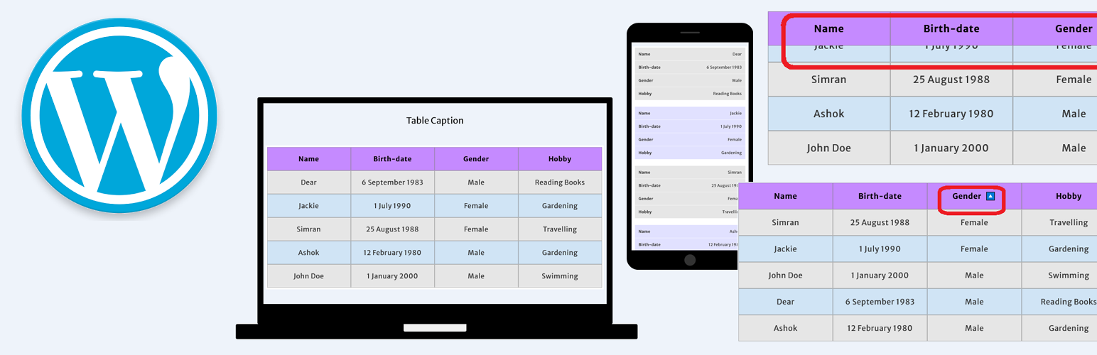
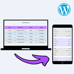
- Responsive Table: Automatically adjusts tables to fit any screen size, ensuring optimal readability on mobile, tablet, and desktop devices. Standard HTML tables often overflow on mobile screens. This PlugIn automatically forces tables to adapt dynamically to smaller screen sizes (like smartphones and tablets) so the text stays readable and the layout doesn’t break your site’s design.
- Sticky Table Head: If a Table is too long with too many rows, then some users forget context of what each column represents. So, you should lock table headers. This PlugIn keeps table header visible while user scrolls the table, and it helps users maintain context without forgetting what each column represents.
- Table Header Sortability: Enable header sorting functionality for your tables as needed. It adds interactivity by allowing visitors to click on a column header to sort the data (alphabetically or numerically), which is incredibly useful for data-heavy charts or product lists.
- Customize Styles: There are many popular table PlugIns where you have to build tables in a separate dashboard and paste a shortcode [table id=1] into your post, but this PlugIn does not have that sort of problems at all. This PlugIn works directly on the tables you type into your page or post editor. You can also customize the desktop and mobile CSS styles right from the PlugIn’s settings page.
Video Preview
Why is this PlugIn best?
Direct Editing: Use the Classic or Gutenberg editor to create and edit tables directly in Page or Post or Product. Tables are styled and functional without additional markup or complicated workflows.
No Shortcode Hassles: Skip the extra steps, as tables are styled and responsive without additional markup. But you have your freedom to custimize the default styles.
Cross Browser Compatibility: Whether you are on a desktop, laptop, tablet, or smartphone, this PlugIn works smoothly with almost every leading browser, including Chrome, Firefox, Edge, Safari, Opera, and Brave.
QC Passed: Tested to work with commonly used Themes and PlugIns.
Lightweight and Fast: The PlugIn takes very low space in hosting, and optimized to load quickly and use minimal server resources.
Are you happy?
You are requested to provide positive review in WordPress.org with some extra clicks to share this PlugIn in your social network
Looking for something special? Buy Pro
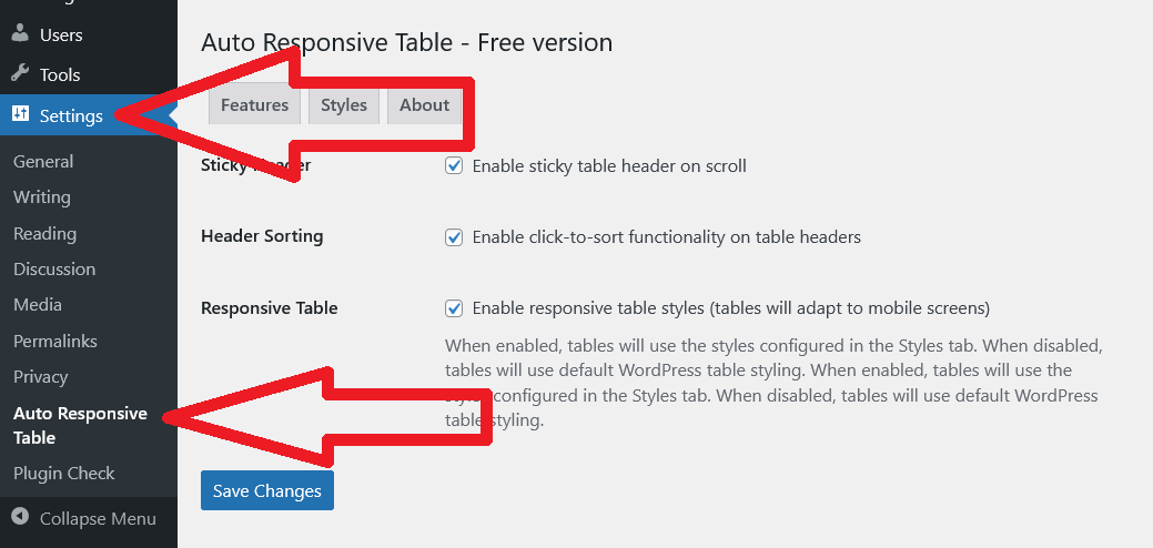
You may enable all three
- Responsive Table
- Sticky Table Head
- Table Header Sortability
options, any two, or a single one via the settings. In the free version, these specified modifications will apply uniformly across all Tables of your WordPress website. This is healthy for small websites. But if your website has lots of posts and pages, with lots of tables, you should consider upgrading to Pro. The Pro version allows control to turn On or Off these “Sticky Table Head, Header Sorting, Responsive” options directly at the individual page, post, or product level. Even you can customize “Desktop CSS Styles of Tables” and “Mobile CSS Styles of Tables” at individual page, post, or product level.
Buy WordPress PlugIn for Auto Responsive Table with Sticky Table Head, Header Sorting and Table CSS Style Customization from trusted marketplace Gumroad.
Thank you
Tawhidur Rahman Dear
- Dear IT Solution : IT Consultancy, Web and App Development, AdSense, SEO, Graphic Design, Password Recovery and Security, Online Marketing, Corporate Services
- Dear Store : WordPress PlugIn, JavaScript, CSS Code, Blogger Theme, Desktop Software for Windows
- Dear Apps Corner : More than 60 Android Apps to make your life beautiful