Aha Mobile Menu – Responsive Off-Canvas Mobile Menu & Hamburger Navigation

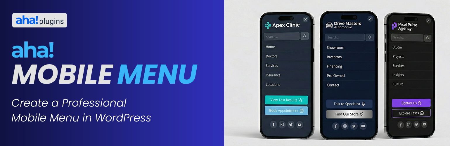
Mobile Menu
Lightweight mobile menu (off-canvas) for WordPress. Works on desktop too. Aha Mobile Menu adds a simple, fast, and customizable off-canvas menu to your site: it slides in from the left or right with slide or fade animation, and can be shown on mobile only or on desktop as well.
Product page | Documentation | Support | Pro add-on
Features:
- Enable/disable the menu and choose position (left or right)
- Slide or fade animation
- Optional: show only on mobile (viewport < 768px) or on all devices
- Logo at the top of the menu
- WordPress navigation menu selection
- Built-in search box
- Social links with automatic icons (Facebook, Instagram, Twitter/X, LinkedIn, YouTube, WhatsApp, and more)
- Color customization: background, text, close button, search, menu links, social icons
- Color palettes for quick styling (default, dark, light, purple, blue, green, etc.)
- Close on click outside and on navigation
- Configurable trigger: default class
aha-open-sidebaror custom CSS selectors - Page and post type exclusions so the menu is not loaded where you don’t need it
- Hooks for customization
- Uninstall tab: choose whether to remove plugin options from the database when the plugin is deleted from Plugins Installed Plugins (not on deactivate alone). If you use Aha Mobile Menu Pro, the same preference applies when removing the Pro add-on’s license option.
Translations
The official language of the plugin is English. The following translations are included out of the box:
- Português do Brasil (pt_BR) — Brazilian Portuguese, complete translation included.
- Español (es_ES) — Spanish, complete translation included.
Want to translate the plugin into your language? You can contribute translations on translate.wordpress.org.
Demo, documentation & addons
Watch a demo, read the full documentation, and learn about available addons on the Aha Mobile Menu Product Page.
Video tutorial
Step-by-step setup: Aha Mobile Menu tutorial on YouTube.
Requirements
- Your theme must provide a button or element with the trigger class (e.g.
aha-open-sidebar) to open the menu. Add this class to your hamburger icon or menu toggle.
Discover more WordPress plugins: Visit Aha Plugins